Building a seamless, engaging 0-1 referral experience to support Sonar in acquiring users
1 Product designer (me)
1 Product manager
1 Developer
What I did
Led the end-to-end design of Sonar’s new referral feature.
Jul - Aug 2024 | 3 weeks
Product design / Interaction design / Product strategy / User testing
What’s Sonar? 🤔
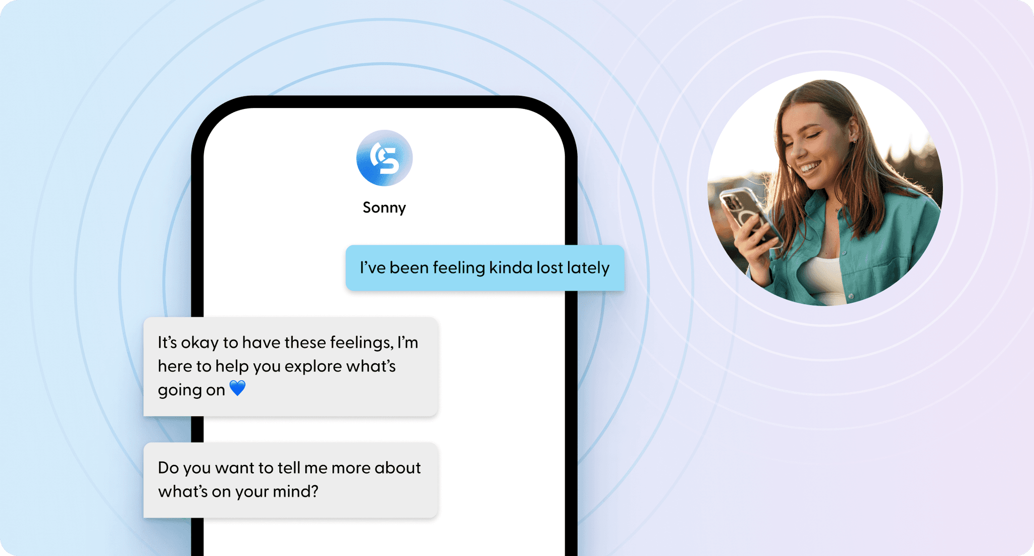
Sonar provides a friendly, judgement-free AI chat buddy for teens
Sonar is a scalable AI-driven mental health platform for schools, offering 24/7 chat support to help students with their mental wellbeing. Users can talk to Sonny, an AI-powered wellbeing companion supervised by a human, for guidance and support anytime.
The challenge 🔍
Teens use Sonar in school, but no new users are joining
Sonar’s app engagement is strong, yet user acquisition is surprisingly low. To address this, I led the design process, working closely with product lead and engineers to solve the 2 key pain points driving the issue:
The solution 🪄
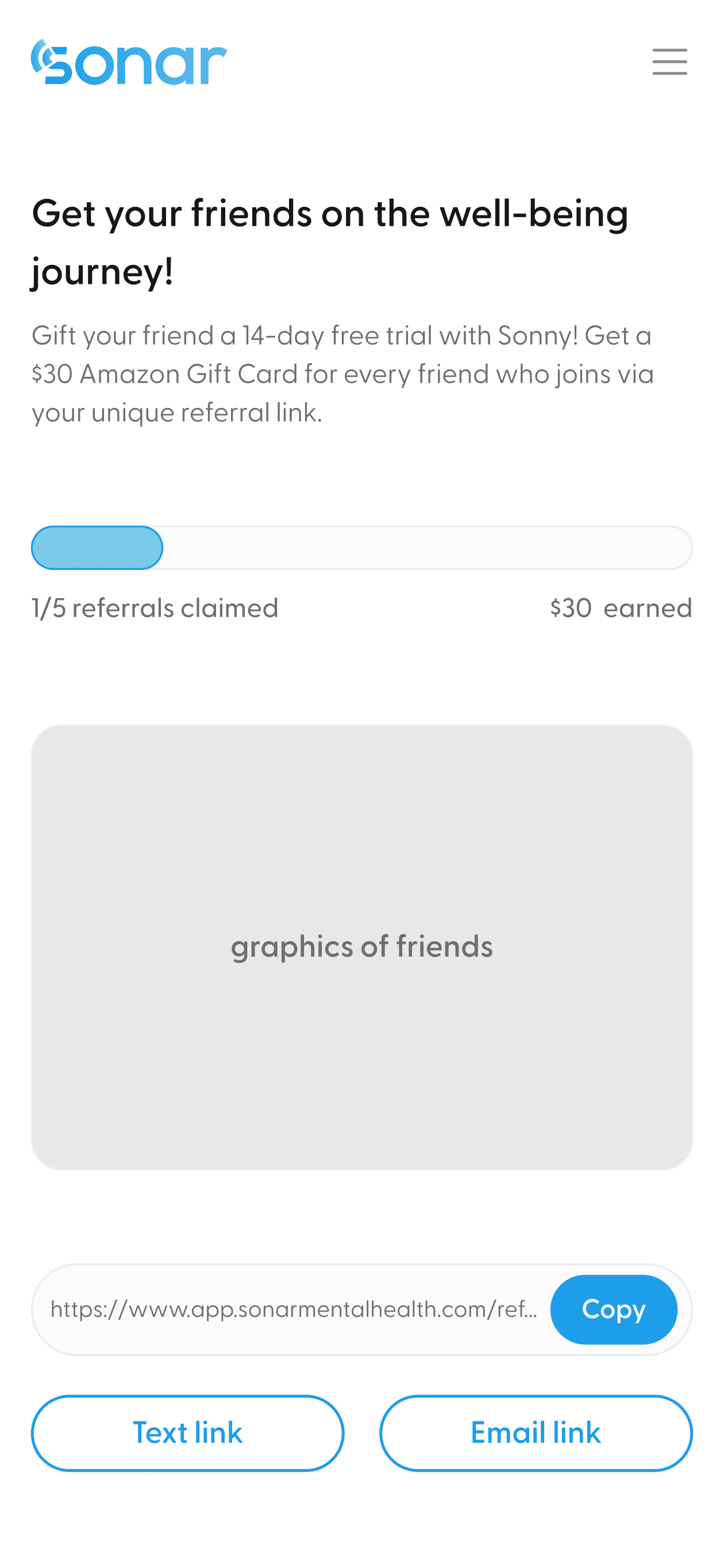
Introducing “Invite a friend” feature: refer with fun & ease!
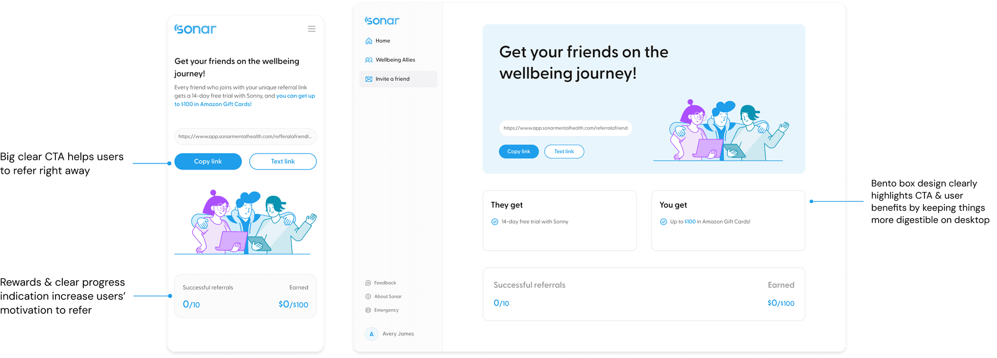
We made a huge impact! 🎉
The feature had just launched and successfully rolled out to all existing users!
While this is still in early phase, here’s the UX principles I followed to ensure its success:
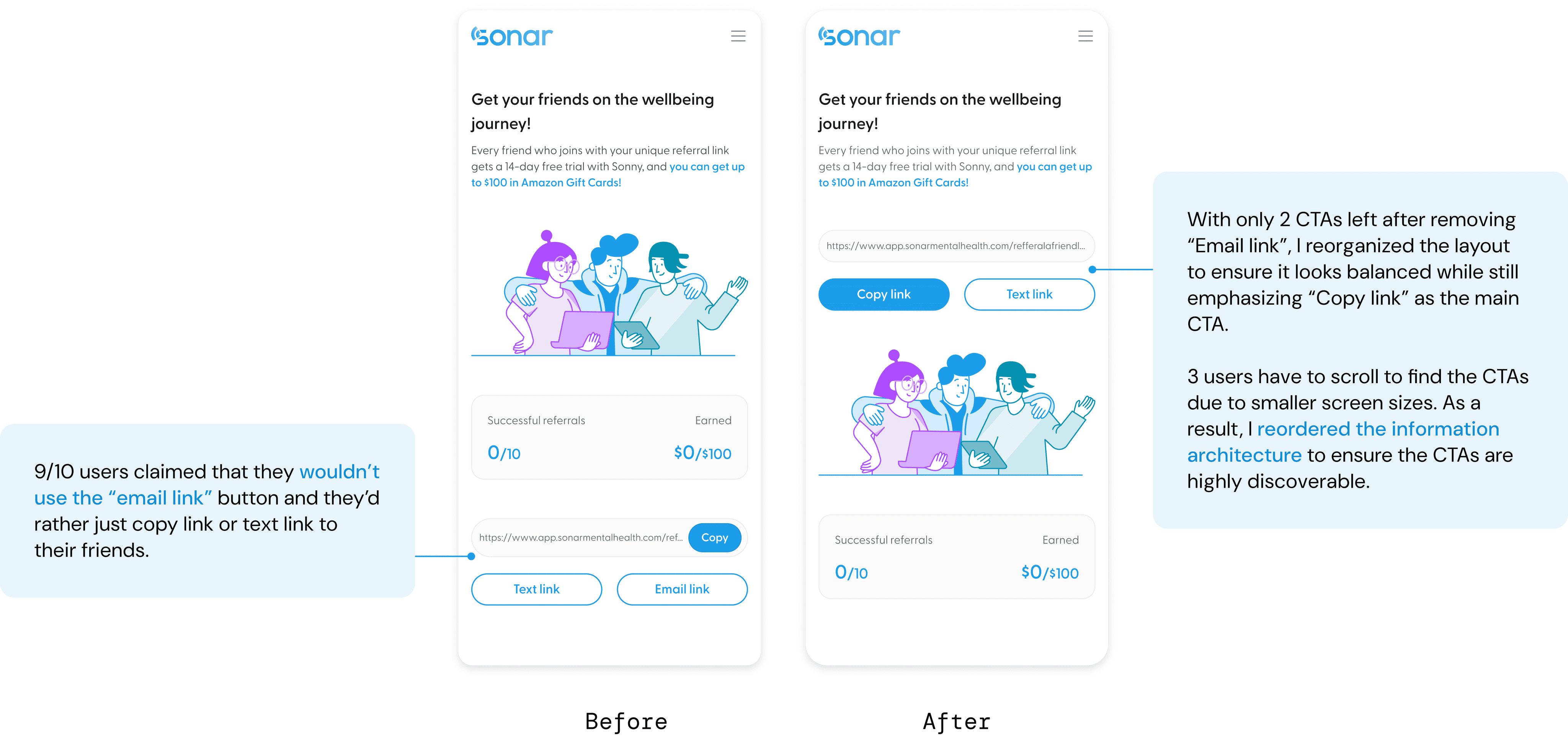
Ease: 2 steps only with clear CTA
This will lead to higher conversion rate since users are more likely to take actions when the effort is small.
Fun: Instant rewards & progress tracker
This will increase referral success rate since users are more drawn to immediate benefits & more motivated when progress is shown
User Research
Digging into the "why" behind users not sharing Sonar
I wanted to understand why current users were not sharing Sonar with others; thus, I partnered up with the user researcher to conduct user interviews with 10+ existing users.
We came to the conclusion that…
Users are not sharing the app with others since 1. it’s difficult to do so 2. they lack motivation to share.
Who are we targeting?
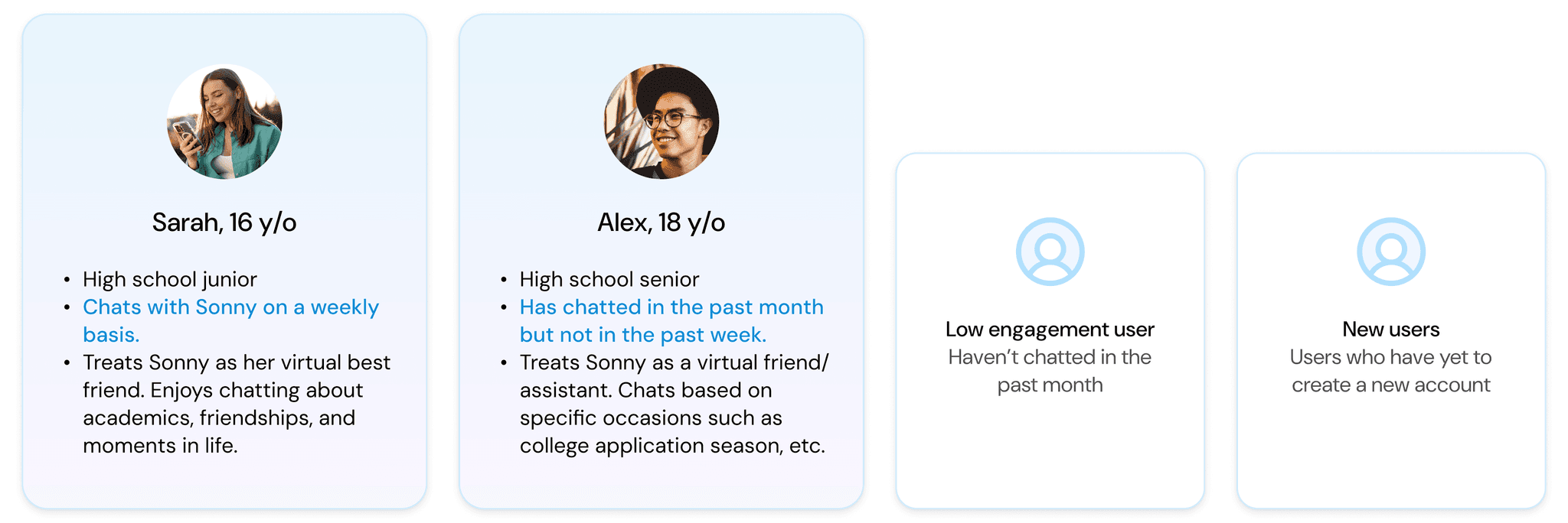
We want to target existing users with mid-high engagement to acquire high-quality leads
Users who already had experiences chatting with Sonny and were actively engaged will more likely refer individuals who have similar needs as them, who fit our target user profile better.
Let's brainstorm!
So… what are some potential solutions?
I led a ideation workshop with the entire product team to gather new ideas and help the team align on the project goal. We landed on a few ideas at the end:
Deprioritized solutions:
Social media giveaways 📱
Social media is a popular way to gain Gen Z’s attention. However, Sonar has a weak social media following so it’s hard to build trust first.
In-person promotions 🙋🏻♀️
Since the school was in summer session and might not have many students in person, we decided to save this for later.
Prioritized solutions:
New referral feature 👀
This solution allows us to utilize our existing users to bring in their friends, helping us reach an audience that has a higher chance of having similar interests and needs as our current users.
Monetized rewards 🎁
We decided to use monetized rewards to motivate users to use the referral feature.
Scoping down…
How might we design a referral feature that encourages and helps users easily and quickly share Sonar to others?
Finding some inspo
How do other apps design referrals?
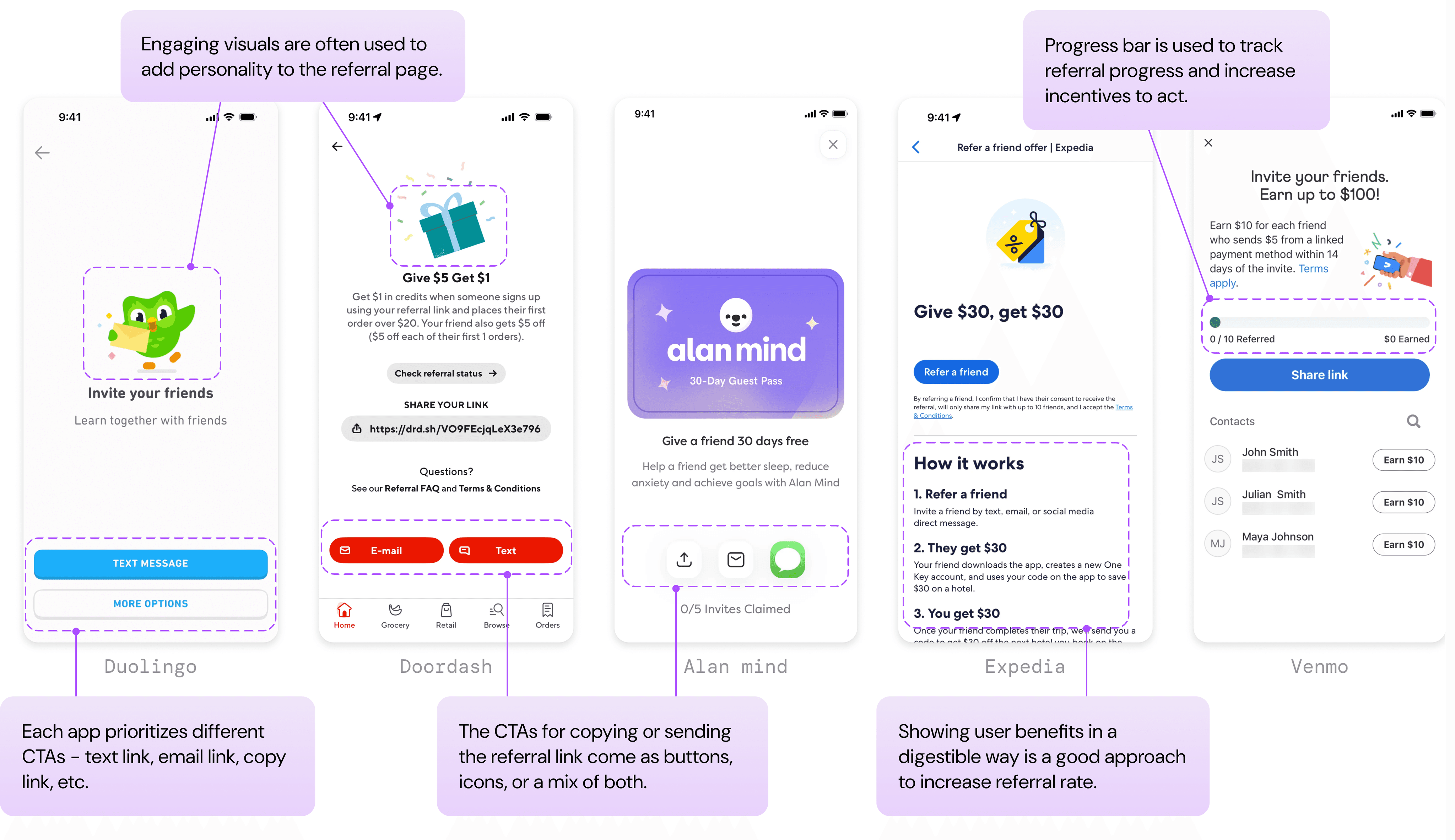
I sought inspiration from direct/indirect competitors and well-used apps to get a sense of how referral features are designed. I noted down some common trends that can be used in my design:
Design principles
Design with brand value in mind
Unlike other mental health apps, Sonar stands out with its relatable, not-so-serious approach to conversations with users. According to our UX research, students prefer casual, gen-z language when having a conversation with AI.
Friendly & welcoming
Casual & relatable
Simple & Intuitive
As a result, I used Gen Z lingo and emojis to establish a friendly, casual tone in the UX writing.
Let’s visualize our ideas! 🎨
Visualizing where the feature lives and how it looks like through mid-fi design
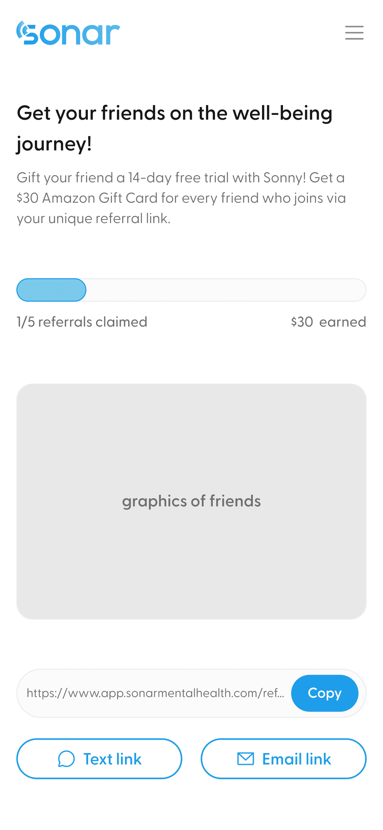
After chatting with the developers, I decided to jump straight into mid-fi design. This helps them grasp the layout better and start coding sooner. I also focused on mobile designs first since our target users (young adults and teens) are more active on their phones.
Option A
Enter from homepage
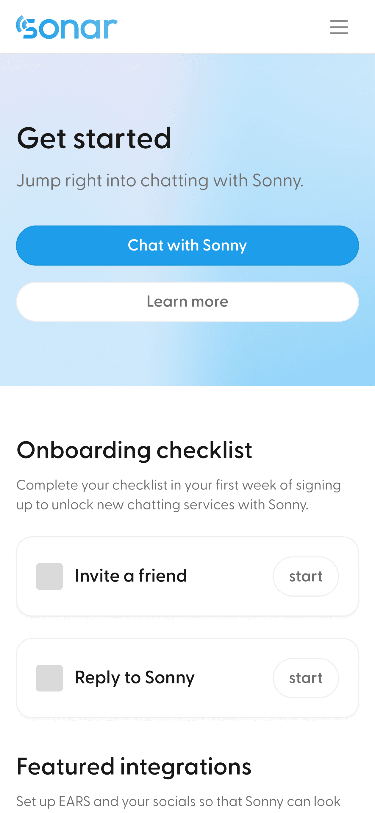
Discoverable on both web and mobile
Take away focus from other content of the home page
Option B
Enter from side menu
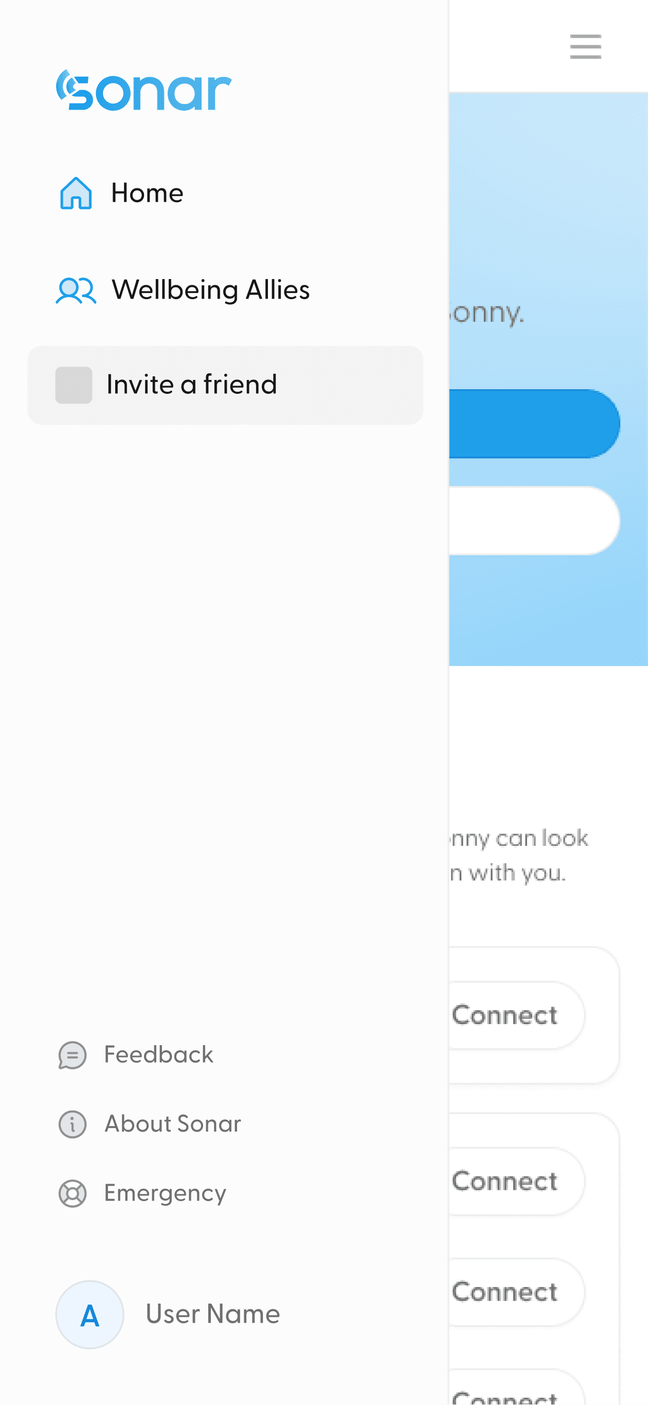
Great for scalability; doesn’t fight with other content on the page
Not as discoverable on mobile
Entry point
CTA buttons
Text only buttons
Text + icons buttons
Icons only buttons

With illustration
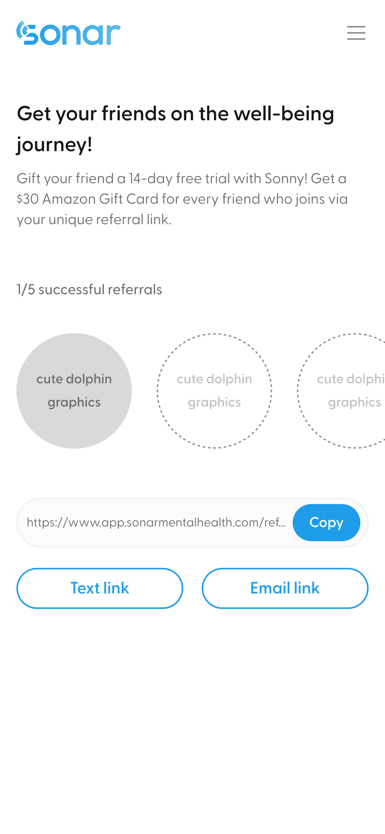
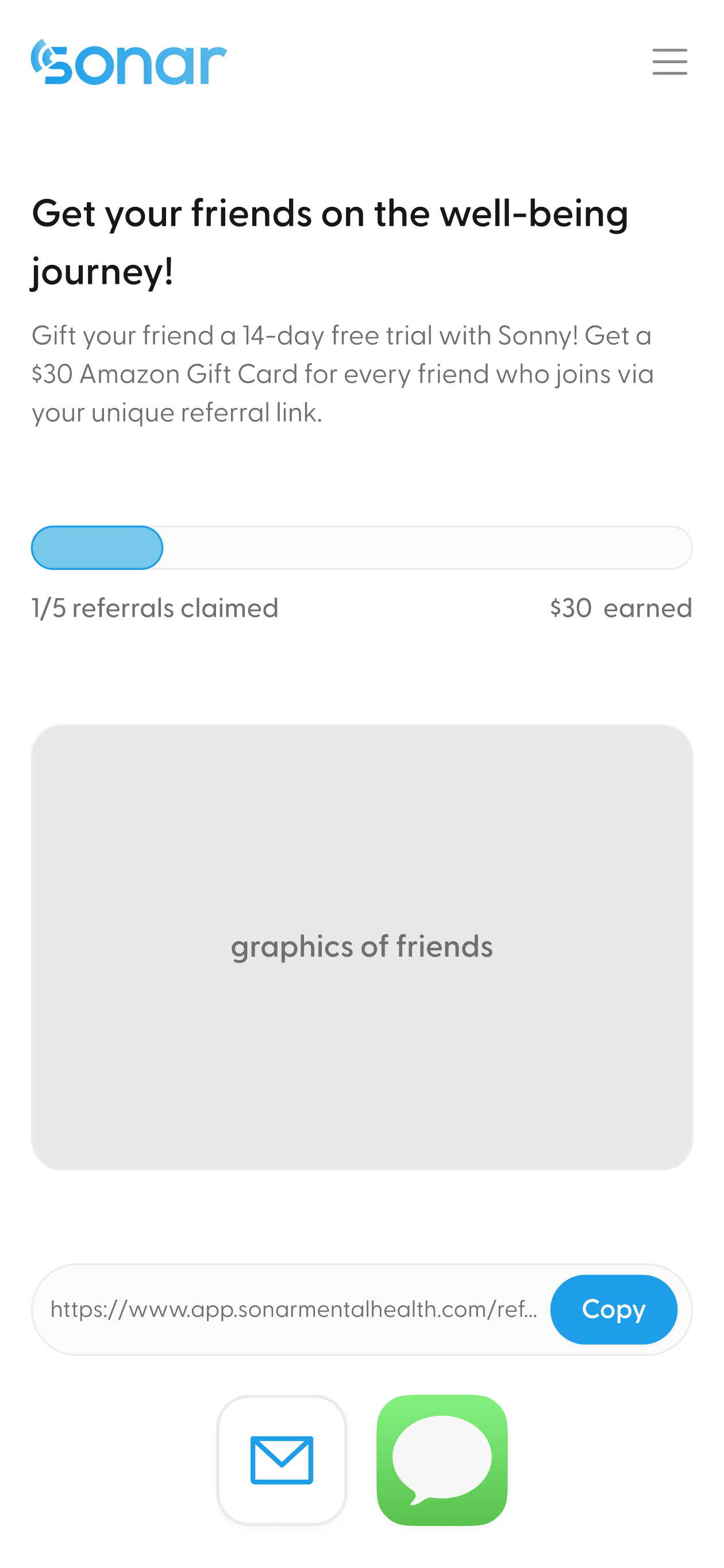
With badges
Visual elements
Aligning with developers
Understanding technical capabilities & making trade-offs
To refine the mid-fi designs, I met with developers several times to discuss technical details and speed up the MVP launch. We discussed on:
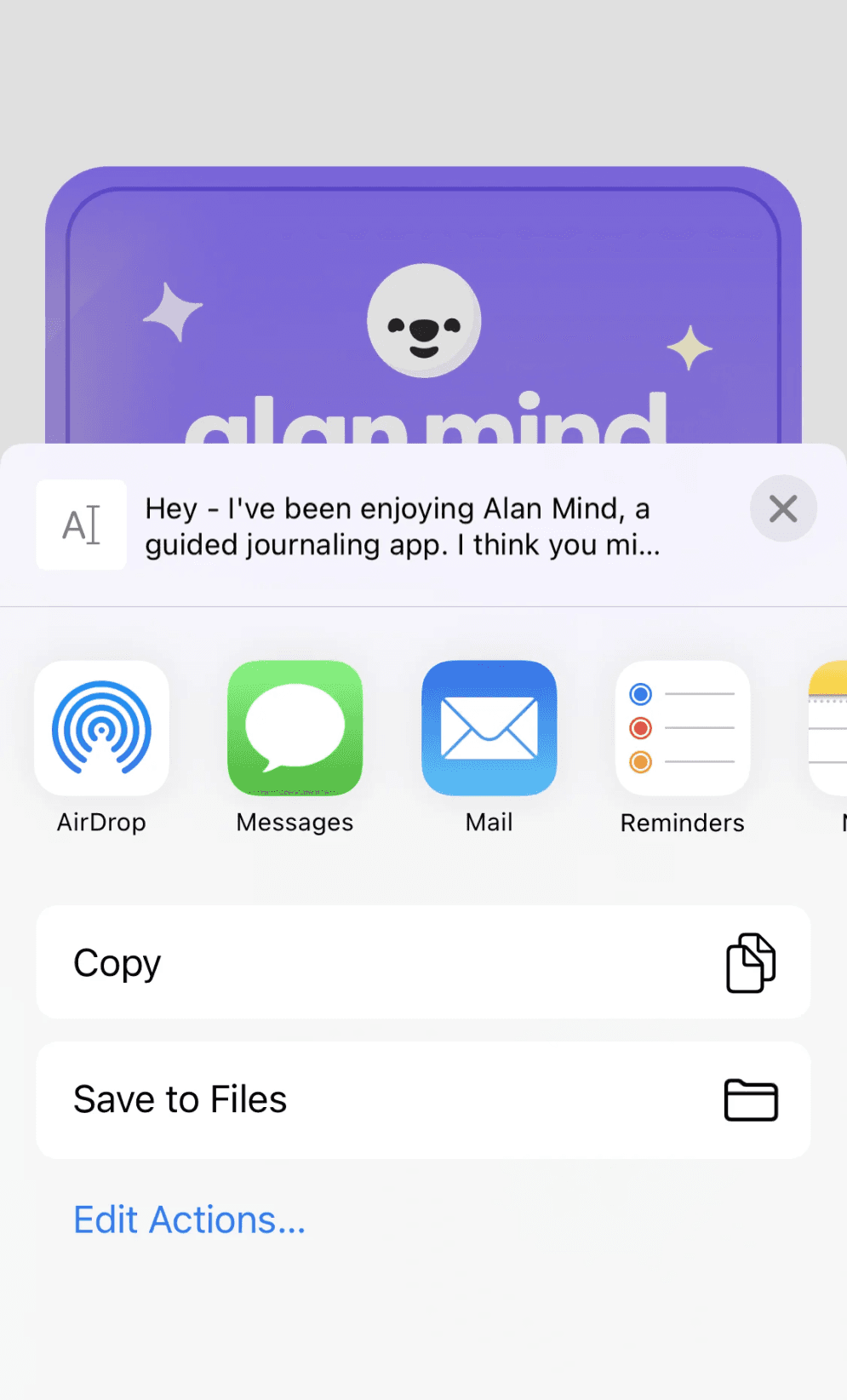
IOS sheet application
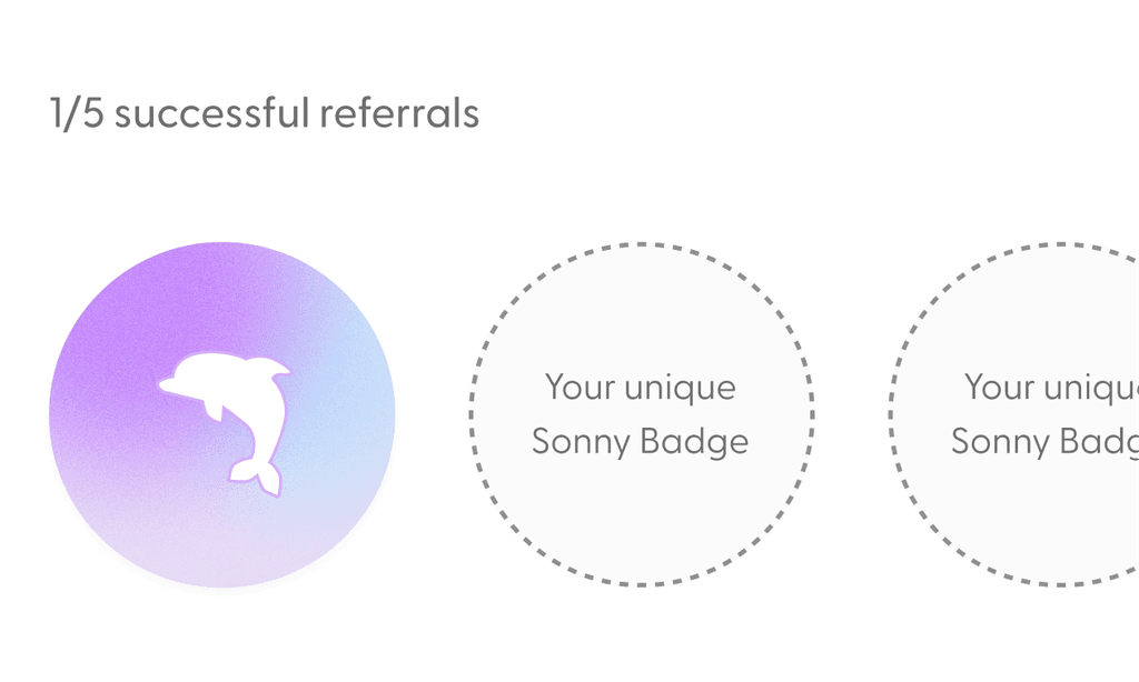
Badges implementation
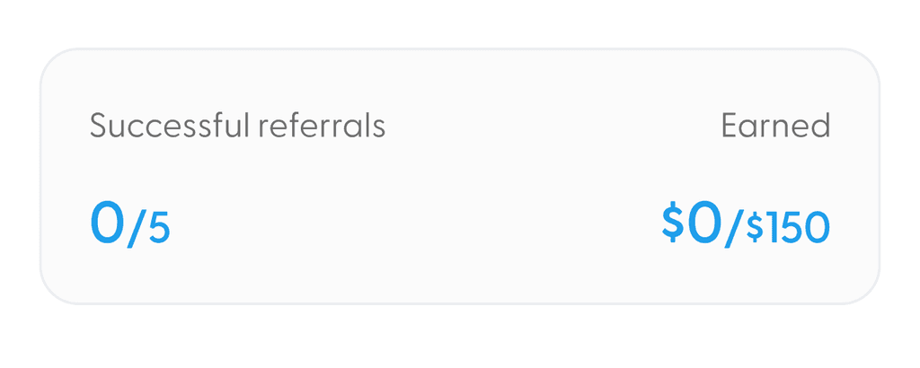
Progress bar display
Test & iterate pt 1
Gathering user feedback on usability & visuals
After working with the developers on trade-offs, it’s time to get user feedback! We ran 10 user tests to fine-tune the design. Here are the highlights:
Test & iterate pt 2
A/B testing on the web design
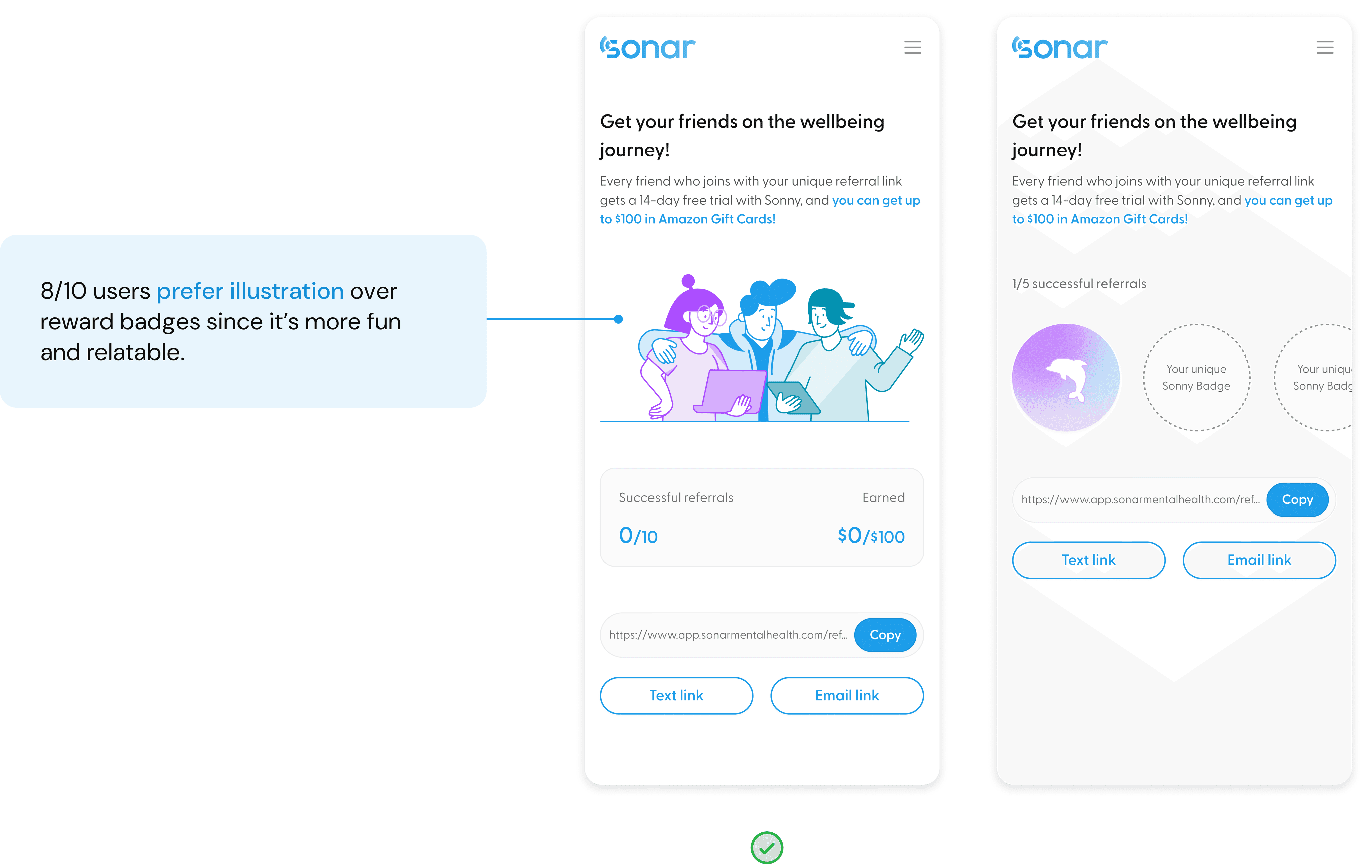
After finalizing the mobile design, I created two web design options for cross-device accessibility and conducted A/B testing to select the best one.
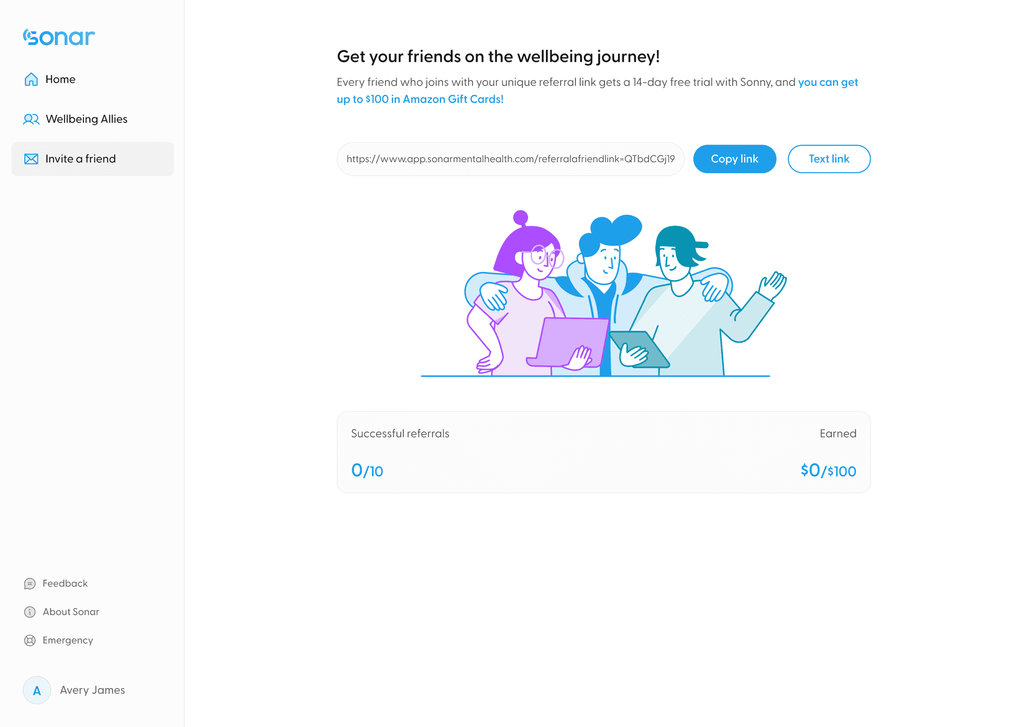
Option A
Same design as mobile
Hard to find where to focus
A lot of empty space
Consistent with mobile design
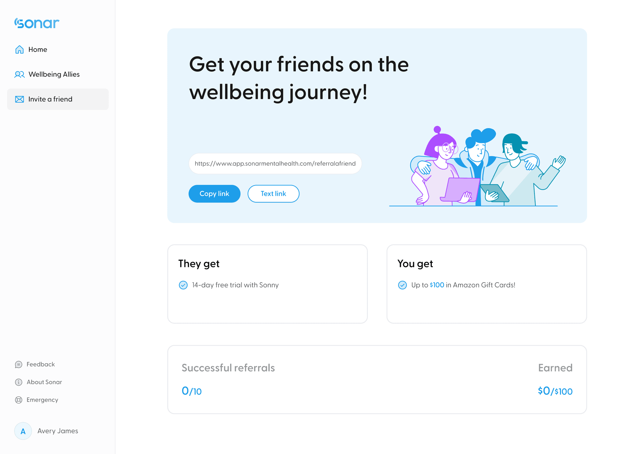
Option B
Bento box design
Clear information hierarchy
Strong visual impact
8/10 users preferred option B due to the clean and easy-to-understand layout. With this result, I successfully convinced the product lead to use option B as the web design.
And here it is...the final design!
New feature unlocked 🔓 — refer your friends with fun and ease!

Let’s start the journey!
Users can access the referral feature from the side menu by clicking on “Invite a friend”.
Refer your friend 🙌


Congrats, popular! 🎊
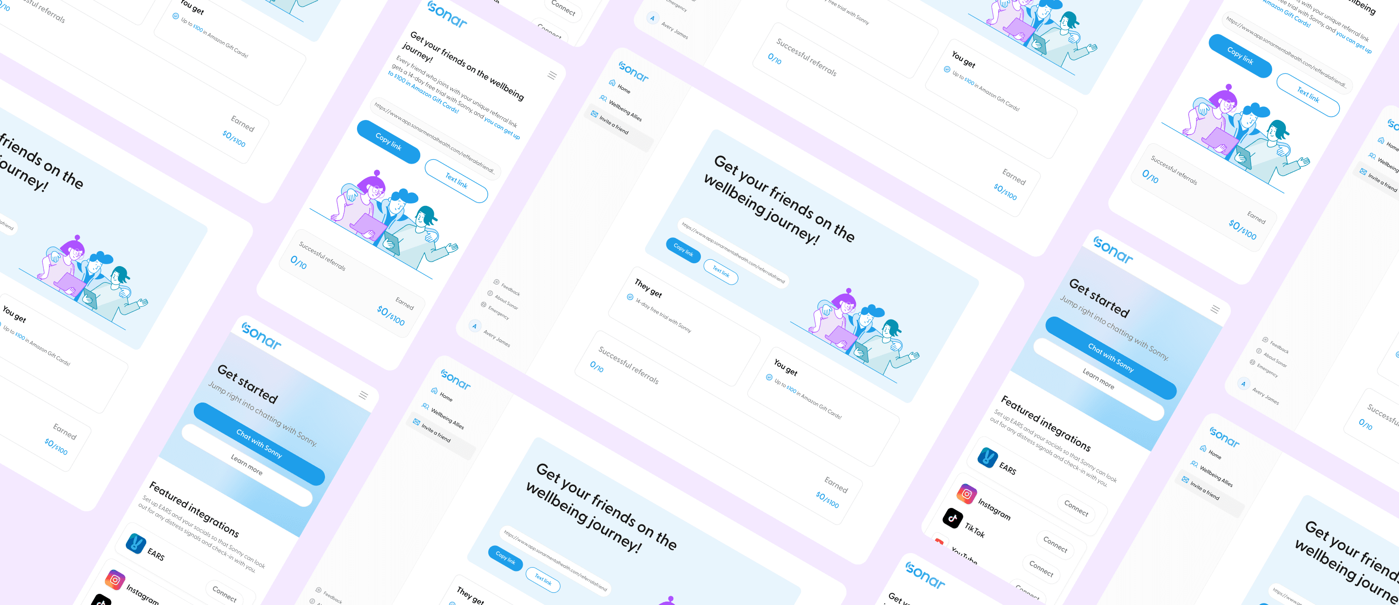
Make it responsive
What to do next
The referral feature had successfully rolled out to all existing users!
Here are some next steps I wish to take:
1. Measure success through these metrics: total referral attempts, avg. time to first referrals, # of unique referrals, # of successful referrals, & referral conversion rate.
2. Conduct A/B testing on incentives and UX writings.
3. Explore more on the community-building aspect of the referral feature.
Reflecting on what I learned
Keeping a open communication with developers is so important 🙋🏻♀️
This was my first solo project at Sonar, and I quickly realized how crucial it is to communicate openly with our developers to make sure my designs are feasible. Working in 2-week sprints taught me to focus on the most important features for the MVP and refine from there. It also gave me a better sense of how much time and effort developers need for each design handoff!
Getting better at justifying my design decisions 🙌
There are many moments during my time working at Sonar that I was asked to justify my design decisions - why did you choose this layout? Why did you place the CTA here? These questions pushed me to delve deeper into my design decisions, carefully considering each iteration and researching UX principles and industry best practices. This process not only enhanced my understanding of design rationales but also sharpened my ability to articulate my decisions effectively, helping me grow significantly as a UI/UX designer.

